Season 4 movies update: Sailor Moon Eternal - Delayed to 2021 (Part 1 on January 8th & Part 2 on February 11th)
- Thread starter NJ_
- Start date
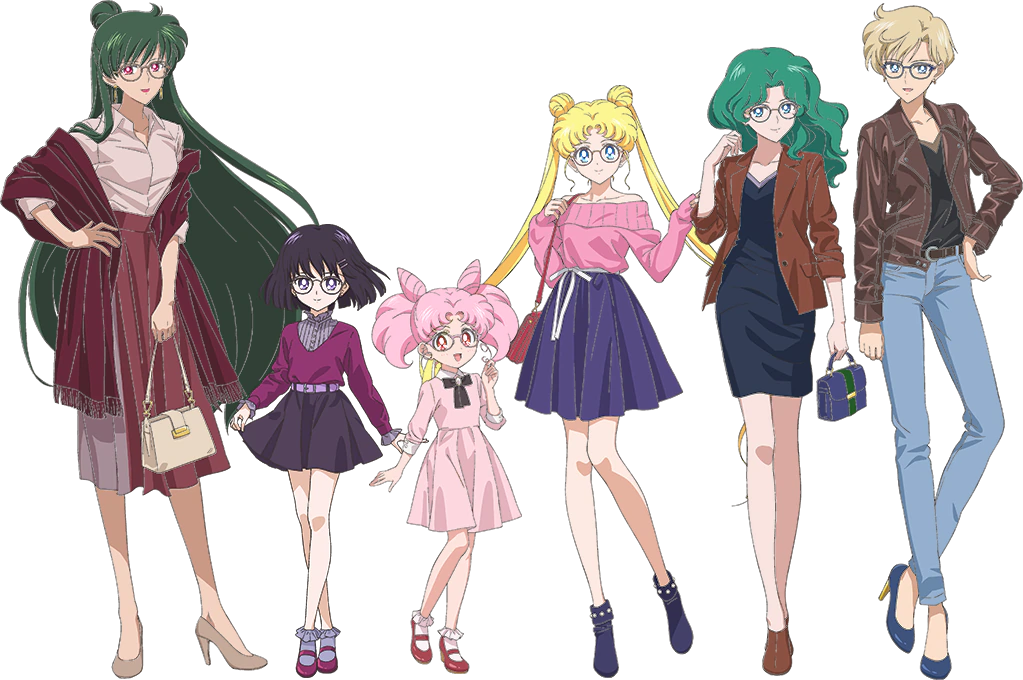
Harumichi's outfits look amazing! Haruka wearing heels was a bit surprising, but I can see her borrowing them from Michiru (or Michiru getting them for her as a gift). Setsuna's outfit is nice and Hotaru's is so classy! And Usagi and Chibiusa are just as cute as always! 
edit: I just noticed that Haruka's heels are in her theme colors (blue with a hint of gold)! How clever!

edit: I just noticed that Haruka's heels are in her theme colors (blue with a hint of gold)! How clever!
she looks exactly the same as the manga, you wanna calm down a bit?
Yes these look like great character designs and they resemble the manga enough, while being not too complicated. Sadly, the art used is quite different from the actual designs. I wish the guy who did these did the designs as well. Or maybe these are based on the final version we haven't seen yet. The inners had a lot of tweaks from these designs based on the ones revealed in a magazine article. Either way the art is good enough. Cannot wait to see them all in motion.
Some people cannot accept that there are other versions of these characrers than the 90s show. They should have learned by now to avoid anything else if it upsets them.
Yes these look like great character designs and they resemble the manga enough, while being not too complicated. Sadly, the art used is quite different from the actual designs. I wish the guy who did these did the designs as well. Or maybe these are based on the final version we haven't seen yet. The inners had a lot of tweaks from these designs based on the ones revealed in a magazine article. Either way the art is good enough. Cannot wait to see them all in motion.
Yes these look like great character designs and they resemble the manga enough, while being not too complicated. Sadly, the art used is quite different from the actual designs. I wish the guy who did these did the designs as well. Or maybe these are based on the final version we haven't seen yet. The inners had a lot of tweaks from these designs based on the ones revealed in a magazine article. Either way the art is good enough. Cannot wait to see them all in motion.
We had JINS art for Inners 4 years ago, with SMC3 style 


They looked this good in the Tellu episode, but otherwise nothing like it. Still even the new collab art is a lot more elegant and composed and the mouths are not as wide.Usagi's odangos are way better as well. Too bad in the transformation they were so weird half the time.
Last edited:
^
That's why I say don't care about images in magazines and ads anymore. Everthing is meaningless if the actual movie is ugly.
That's why I say don't care about images in magazines and ads anymore. Everthing is meaningless if the actual movie is ugly.
Well, it wasn't ugly per se. A lot of the frames are quite pretty, especially in the trailer. Honestly I can survie sloppy frames in a transformation if the rest of it looks good. We are all too harsh on Eternal as we have very little to judge. I hope more leaks are to come and sorry not sorry. They take their sweet time to reveal stuff officially.


I have a strong belief that we will know Mamoru's design this month. 


Likes:
ChibiNehellenia
The transparent sleeves are different from manga / 90's anime / Crystal 3. Did Naoko tell Tadano to change them?


 right there
 Although in my opinion, her heart brooch is too lightly colored and I'd rather see it be the shade of purple her sailor collar, and choker is (that's a thing that always irked me about the design Mercury had in Crystal, her brooch was too lightly colored and blended in with her bow).
Oh, this guy is a great animator too

she looks exactly the same as the manga, you wanna calm down a bit?
Likes:
Starlight and SailorSpySedna
Some people cannot accept that there are other versions of these characrers than the 90s show. They should have learned by now to avoid anything else if it upsets them.
Yes these look like great character designs and they resemble the manga enough, while being not too complicated. Sadly, the art used is quite different from the actual designs. I wish the guy who did these did the designs as well. Or maybe these are based on the final version we haven't seen yet. The inners had a lot of tweaks from these designs based on the ones revealed in a magazine article. Either way the art is good enough. Cannot wait to see them all in motion.
Yes these look like great character designs and they resemble the manga enough, while being not too complicated. Sadly, the art used is quite different from the actual designs. I wish the guy who did these did the designs as well. Or maybe these are based on the final version we haven't seen yet. The inners had a lot of tweaks from these designs based on the ones revealed in a magazine article. Either way the art is good enough. Cannot wait to see them all in motion.
2. I'm ok with some of the other versions of different characters, but for Michiru there is no contest.
Likes:
Starlight and SailorSpySedna
I like her appearance in the 90s anime. One of the most beautiful anime characters I've seen ever.
Likes:
MsImagination


